SAP.com Homepage Redesign
Turning a bulletin board of disparate programs into a unified, research-informed "front door" for SAP's global homepage — from journey mapping and moderated usability testing through global rollout and governance.
The problem
The homepage had become a bulletin board: disparate internal programs competing for space, no consistent global message, and no clear front door for someone who didn't already know what SAP was.
The goal: transform the homepage into a welcoming front door with more consistent messaging globally, while still allowing for localized content and personalization.
Speak to people who don't know SAP
Address an audience unfamiliar with SAP or what it offers.
Informed by SEO research, competitive benchmarkingDon't scare off mid-market
Speak to mid-market users who may feel SAP is too big or too complicated for them.
Informed by corporate strategy, persona development, usability testing, competitive benchmarkingProtect what was already working
Preserve the engagement gains from an earlier interim redesign while improving click-through further down the page.
Informed by behavioral analyticsShift from internal to user-centric
Rebalance the page — which had skewed heavily toward internal, siloed programming — toward content built around what visitors actually needed.
Informed by behavioral analytics, internal stakeholder interviewsResearch & discovery
Before redesigning anything, I mapped how people actually moved through the page.
I built an end-to-end journey map of the homepage experience and a functioning prototype to test it against. I interviewed users on their content needs and paired those findings with behavioral analytics on the page to decide what should surface first — rather than defaulting to whatever internal team asked loudest for placement.
To validate the redesigned page before and after launch, I ran a qualitative, remote moderated usability test with five target-audience representatives — IT and marketing decision-makers with experience researching and buying from Microsoft, AWS, Salesforce, and Google, all based in the U.S. Testers thought aloud through their first impressions of the live page, replicating how a real visitor would experience it unprompted.
What we heard, section by section
Selected findings from the moderated retest, mapped to the actual sections being evaluated.
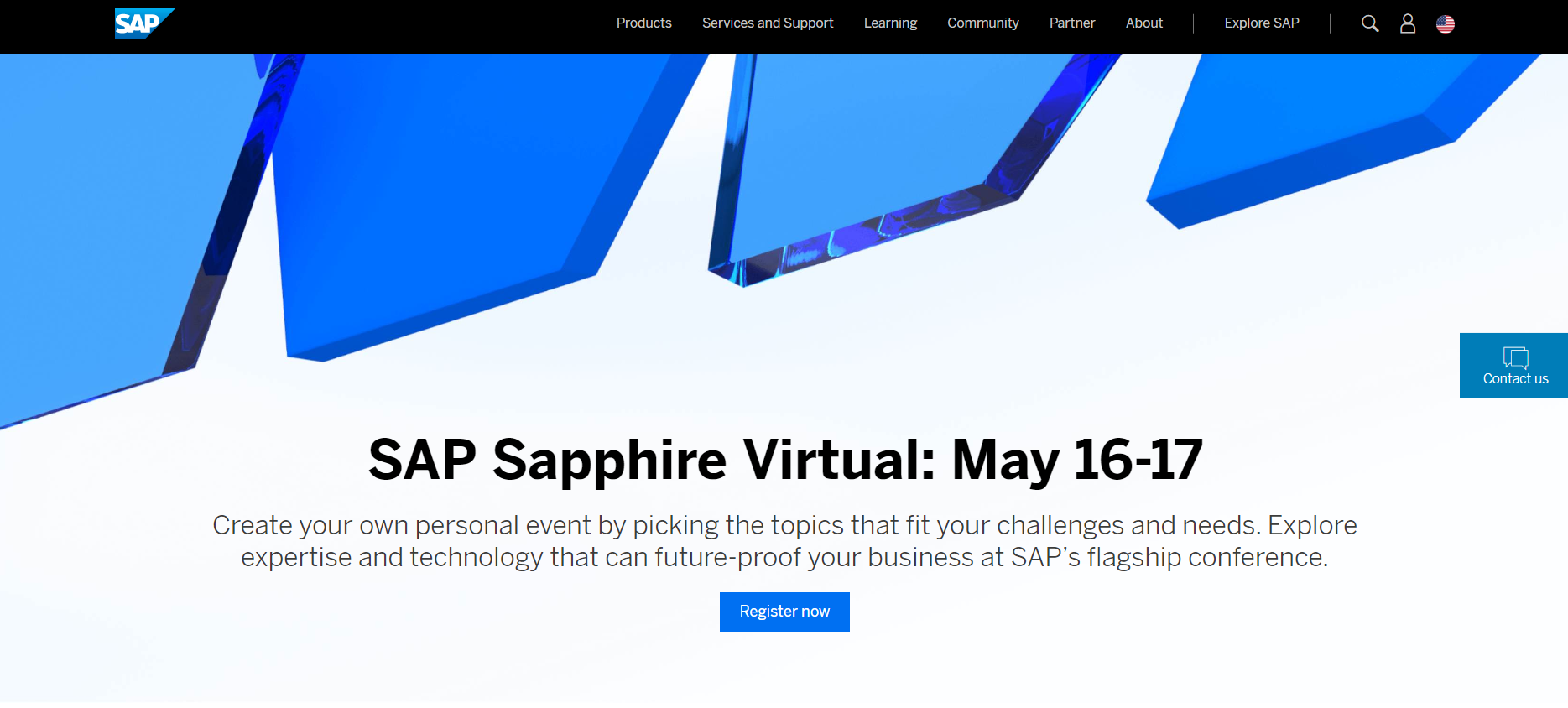
"If I had no idea what your company was, the first thing you're essentially telling me is to go to this event."
The full-screen event banner read as strong and modern, but several testers mistook the homepage for an events page rather than a company front door.
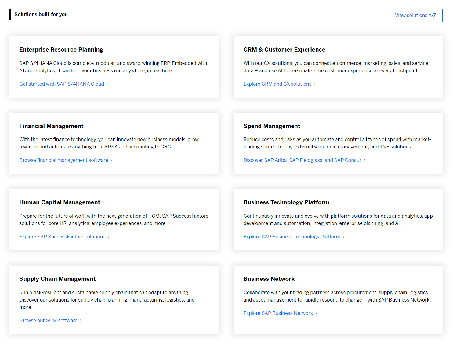
"This is great because, right off the bat, you're seeing like ERP, financial management, etc."
Strongest-performing section. Testers understood the six solution categories immediately and said this was where they'd naturally leave the homepage to go explore products.
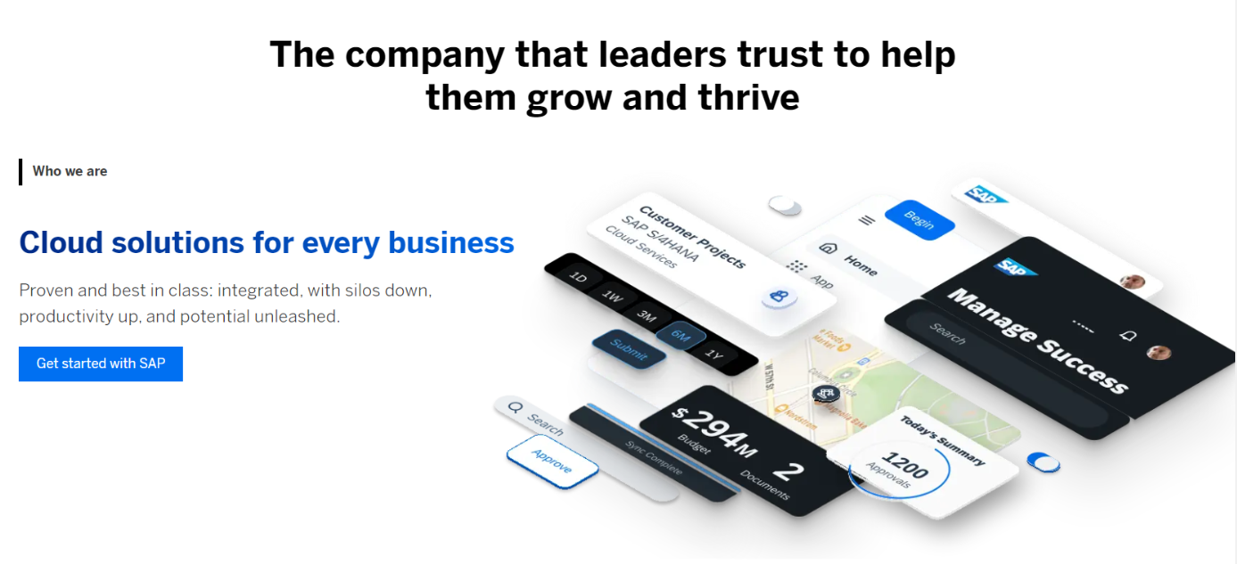
"Every manufacturer you ever ask is going to say that they're the best in class — it's just a marketing ploy."
Visually the favorite section, but the "Proven and best in class" copy didn't land, and most testers weren't ready to click "Get Started" this early in the journey.
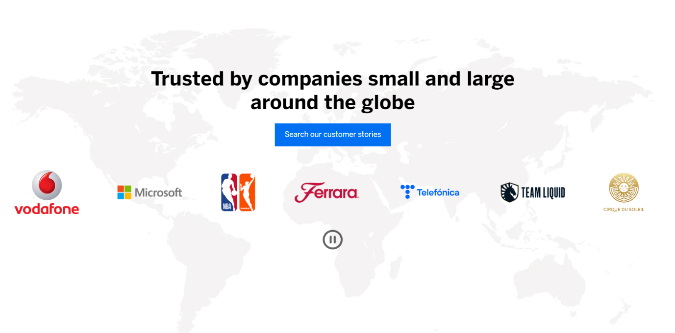
"This is powerful with the logos, showing that you're integrated with different companies across the world."
A clear favorite. Testers appreciated that logos linked to real customer stories rather than sitting static.
Usability score
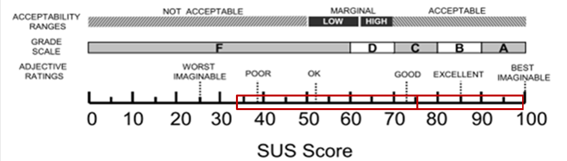
A System Usability Scale score of 75.8 sits above the industry average benchmark of ~68 — squarely in "Good" territory, bordering "Excellent." It's a solid result for a global enterprise homepage serving a wide range of audiences, not a top-box score, and it pointed directly at where to focus next: the hero and the two weakest sections below.
Where it fell short
- — The event-takeover hero banner took up the entire first screen, so several testers assumed the page was about the event rather than about SAP itself.
- — "Solutions that support your success" had the least information density of any section — most testers skimmed past it and couldn't explain what it was for when asked directly.
- — "What's new" was recognized as company news, but testers who were still trying to understand what SAP does found it unhelpful at this stage of the journey.
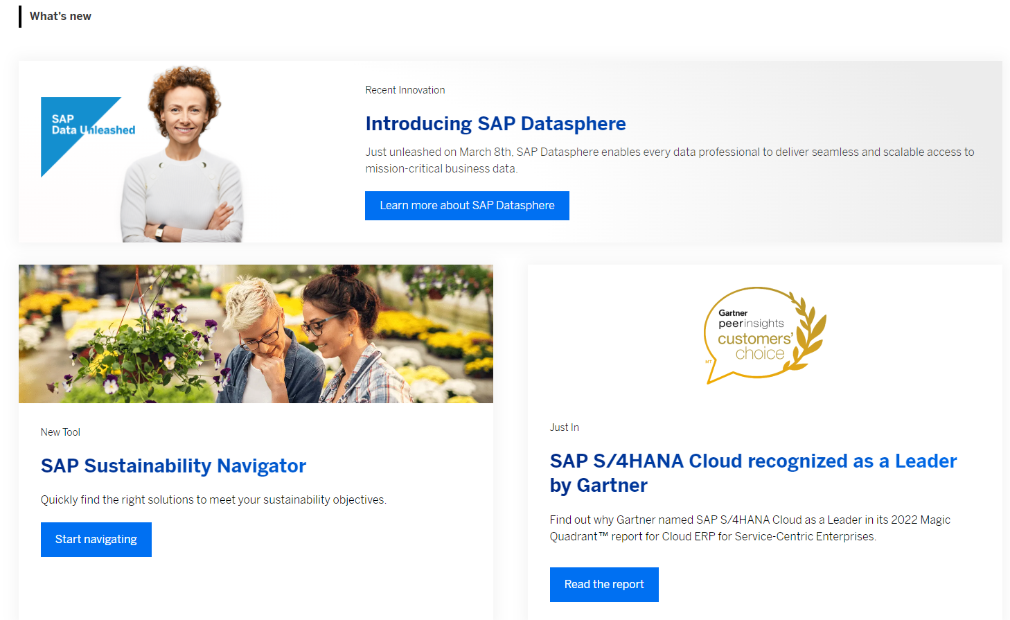
Systemizing it: rules per section
Rather than leave every future homepage decision up for debate, I defined a default state for each module, along with clear boundaries for when it could be overridden regionally and when it could be personalized. A designer or content owner anywhere in the world could then make a confident placement decision — swap a customer logo, promote a regional event, personalize a program by segment — without escalating every choice back to a central team. Modules like the solution grid and brand story stayed evergreen and consistent everywhere; others, like the hero and customer references, were built to flex by region and audience without breaking the overall strategy.
Global rollout & governance
The homepage rolled out in phases — global and top-priority markets first, with the remaining regions following shortly after — so every market launched from the same baseline before layering on local changes.
Standardized intake process for any team wanting to promote content on the global homepage, with the news module refreshed on a regular cadence.
Character-count limits per module and imagery guidelines tied to the brand system, so every regional team produced content that fit the layout without rework.
A defined workflow for translating and publishing global updates to local markets, with clear ownership between global, localization, and regional review teams.
Then vs. now
Pulled from the Wayback Machine and the live site, three points on the homepage's timeline: the bulletin-board era this project was reacting to, the front-door redesign itself, and where SAP has taken the homepage since.
Before this project, the homepage leaned heavily on a single promotional takeover (flagship conference imagery, generic corporate stock photography) with a sidebar of disparate internal links — exactly the "bulletin board" problem the 2023 strategy was written to fix. SAP's front-door strategy then kept evolving after this project: as of 2026, sap.com has moved to an AI-native homepage built around its Joule assistant — a single conversational entry point rather than a page of modules. It's a reminder that "the homepage" is never really finished.
2019 — pre-redesign baseline
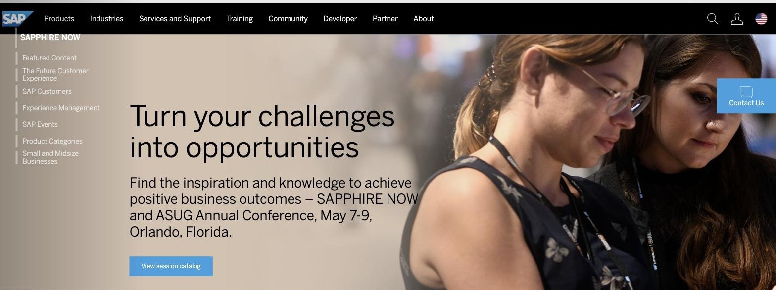
2023 — modular front door
2026 — AI-native homepage (live)
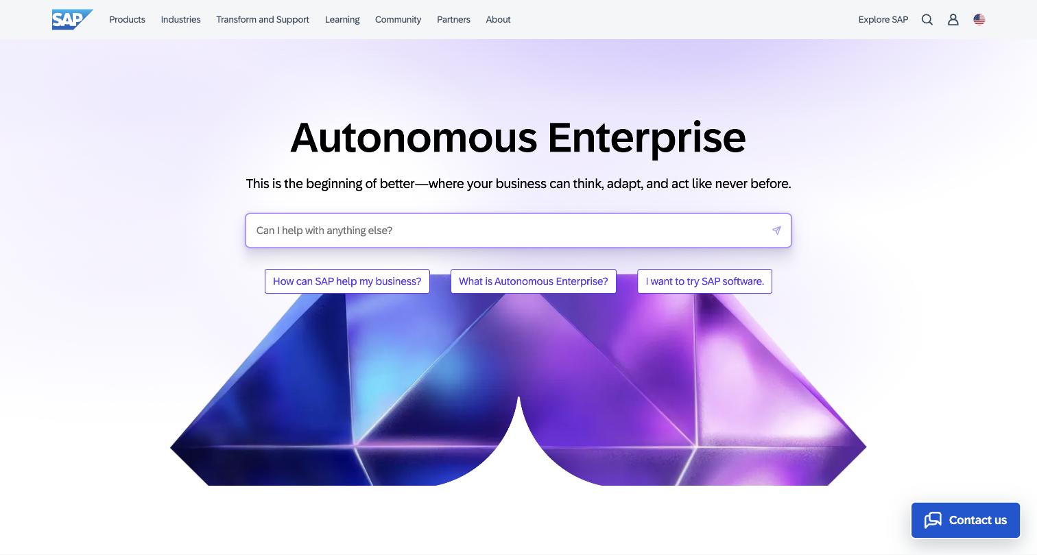
2019 snapshot via web.archive.org.
"Involved in the redesign of the SAP.com homepage, contextual navigation (masthead), and secondary navigation."
From an internal, company-wide announcement marking Natalie's conversion from long-term contractor to full-time employee at SAP.
What Natalie should add before this goes live
- Bounce rate and CTR deltas from Adobe Analytics aren't available post-departure, so the SUS score above is the case study's primary quantitative proof point. If you ever track down a saved export or deck with those numbers, they'd strengthen this further — but the page doesn't depend on it.
- A clear statement of your specific ownership (sole designer vs. team, and what you personally led vs. contributed to) — the source decks don't specify this.
- A short designer's-process visual — wireframes, journey map, or prototype screens — to show the thinking, not just the shipped result.
- Confirmation that these screenshots and this level of process detail are OK to publish. See the flag below.
Before you publish: the two source decks are marked "INTERNAL – SAP Only." I built this page using the live, publicly visible page design plus your own research findings and process — and I deliberately left out anything non-public (login credentials, internal authoring URLs, exact internal tool workflows). But you should double check this against SAP's confidentiality/NDA policy before this page goes live, since screenshots and strategy rationale from an internal deck are a different risk category than describing your process in your own words.